Ombre nails have become a staple in nail art, but there’s a noticeable difference between those that look professionally done and those that appear homemade. The gradient effect, where colors seamlessly blend from one shade to another, can either elevate your entire look or make your manicure seem amateur. Many women struggle to achieve that polished, high-end appearance that makes this nail style truly stand out.
The secret lies not just in the technique itself but in understanding the subtle details that separate expensive-looking nails from their cheaper counterparts. Small adjustments in your approach, product selection, and finishing touches can transform your gradient manicure from basic to brilliant. These refinements don’t necessarily require a professional nail technician or expensive salon visits – they simply require knowing what creates that sophisticated finish.
Throughout the following sections, we’ll explore five essential ways to elevate your gradient manicure. From perfecting your blending technique to selecting the right color combinations and mastering professional finishing touches, you’ll discover exactly how to achieve that luxurious look at home. Keep reading to transform your nail game completely.
Perfect Your Gradient Technique
The foundation of expensive-looking gradient nails starts with flawless blending. Nothing cheapens the appearance faster than harsh lines between colors or uneven transitions. The key lies in patience and the right tools, not necessarily expensive equipment or years of practice.
How to blend colors seamlessly
Seamless blending requires working with wet polish layers rather than allowing each coat to dry completely. This wet-on-wet technique creates natural transitions that professional nail artists use daily. Start with your lightest shade as the base, allowing it to dry just until tacky – not completely set. Your darker shade should then be applied while the base maintains slight wetness, enabling the colors to merge naturally at their meeting point.
The pressure you apply makes all the difference in achieving smooth transitions. Light, feathering motions work better than heavy-handed application. Think of it as watercolor painting rather than house painting – you want the colors to whisper into each other, not shout. Many women make the mistake of pressing too hard, which creates obvious demarcation lines that scream amateur hour.
Temperature plays a surprising role in gradient success. Polish blends more easily at room temperature, so avoid working in cold rooms or with polish straight from a chilly storage area. Warming your bottles slightly between your palms for thirty seconds can improve flow and blending capabilities significantly.
Tools that make a difference
While basic sponges work for gradient effects, the type and quality of your sponge dramatically impacts results. Makeup wedges create different textures than kitchen sponges, with the former typically producing smoother finishes. Fine-pored cosmetic sponges absorb less polish and transfer color more evenly onto your nails.
Professional results often come from unexpected tools. Silicone blending tools, originally designed for nail art stamping, create incredibly smooth gradients without the texture issues sponges sometimes cause. These tools waste less polish and offer more control over color placement. Some nail artists swear by small pieces of latex-free makeup sponges cut into custom shapes for different nail sizes.
Common mistakes that cheapen the look
Rushing the process ranks as the number one mistake that creates cheap-looking results. Each layer needs adequate time to partially set before adding the next. Impatience leads to smudging, uneven color distribution, and that telltale amateur appearance. Set aside at least an hour for a proper gradient manicure – quality takes time.
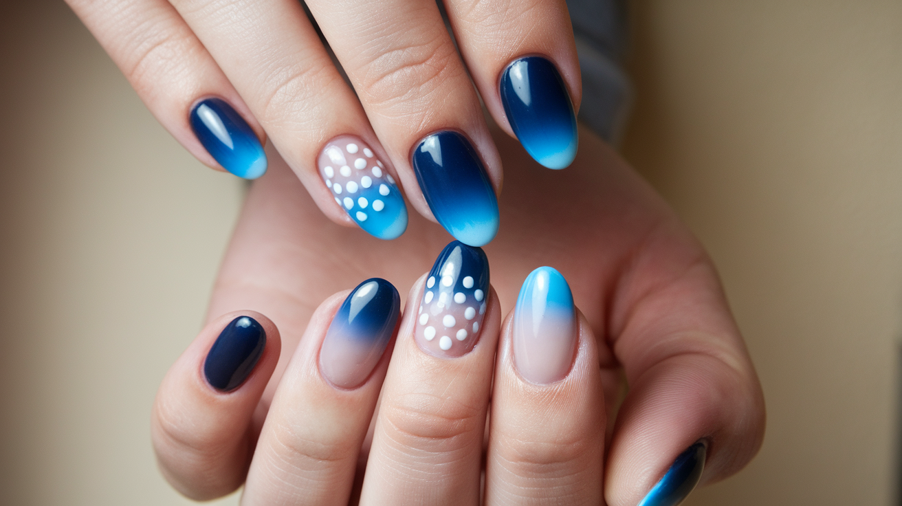
Using too many colors in one gradient often backfires spectacularly. While rainbow effects might seem fun, they rarely look expensive. Limiting yourself to two or three shades within the same color family creates sophistication. The most luxurious-looking gradients typically feature subtle transitions rather than dramatic color shifts.
Neglecting the edges of your nails instantly downgrades the entire manicure. Polish that extends onto skin or cuticles, no matter how beautiful the gradient, looks sloppy. Clean edges require steady hands and immediate cleanup with a small brush dipped in acetone. This single step separates salon-quality work from obvious DIY attempts.
The sponge technique vs brush technique
The sponge method remains popular for good reason – it creates soft, diffused edges that look professionally airbrushed. However, this technique requires practice to avoid the typical pitfalls. The sponge should be slightly damp (not wet) to prevent excessive polish absorption. Dabbing motion rather than dragging prevents streak marks that ruin the gradient effect.
Brush techniques offer more control but demand steadier hands. Using a flat brush to manually blend colors at their intersection points creates precise gradients. This method works particularly well for subtle transitions or when working with gel polishes. The learning curve feels steeper initially, but results often appear more refined once mastered.
Some situations call for combining both methods. Starting with a sponge for initial color placement, then refining with a brush for perfect transitions, gives you the best of both worlds. This hybrid approach takes longer but produces results that rival high-end salon work.
Consider these essential tips for gradient success:
Proper Polish Consistency: Thick formulas create chunky gradients while overly thin polishes won’t build opacity properly
Strategic Color Placement: Place your transition point at the most flattering spot on your nail bed
Multiple Thin Layers: Build color gradually rather than attempting full opacity in one application
Cleanup Between Layers: Remove excess polish from skin before it dries to maintain clean lines
Your gradient technique forms the backbone of an expensive-looking manicure. Without this foundation, no amount of expensive polish or fancy topcoat will save the final result.
Choose Sophisticated Color Combinations
Color selection can instantly elevate or cheapen your gradient manicure. The shades you choose and how you pair them speaks volumes about the overall quality of your nail art. Understanding which combinations read as luxurious versus tacky makes all the difference in achieving that high-end aesthetic.
Colors that scream luxury
Certain color families consistently convey sophistication in gradient nails. Nude tones ranging from pale pink to deep taupe create an expensive minimalist look that complements any outfit or occasion. These subtle shades allow the gradient technique itself to shine without overwhelming the eye.
Deep jewel tones also signal luxury when used correctly. Think burgundy fading to deep plum, or navy transitioning to midnight blue. These rich colors suggest depth and complexity without appearing garish. The key lies in selecting shades with similar undertones – cool with cool, warm with warm – to maintain harmony.
Monochromatic gradients using different values of the same hue always look intentional and refined. A gradient moving from palest gray to charcoal, or from champagne to deep bronze, creates visual interest through tonal variation rather than color contrast. This approach mimics high-end fashion’s preference for subtle sophistication over obvious statements.
Avoiding tacky color pairings
Some combinations immediately signal amateur status, regardless of application skill. Neon colors rarely translate to elegant gradients – their intensity overwhelms rather than impresses. Similarly, holiday-themed combinations outside their season (red and green in July, orange and black in March) appear kitschy rather than classy.
High contrast pairings require exceptional skill to execute well. Black to white gradients, while theoretically sophisticated, often result in muddy gray transition zones that look dirty rather than deliberate. Unless you’ve mastered color theory and blending techniques, stick to gentler transitions that forgive minor imperfections.
Nude and neutral combinations
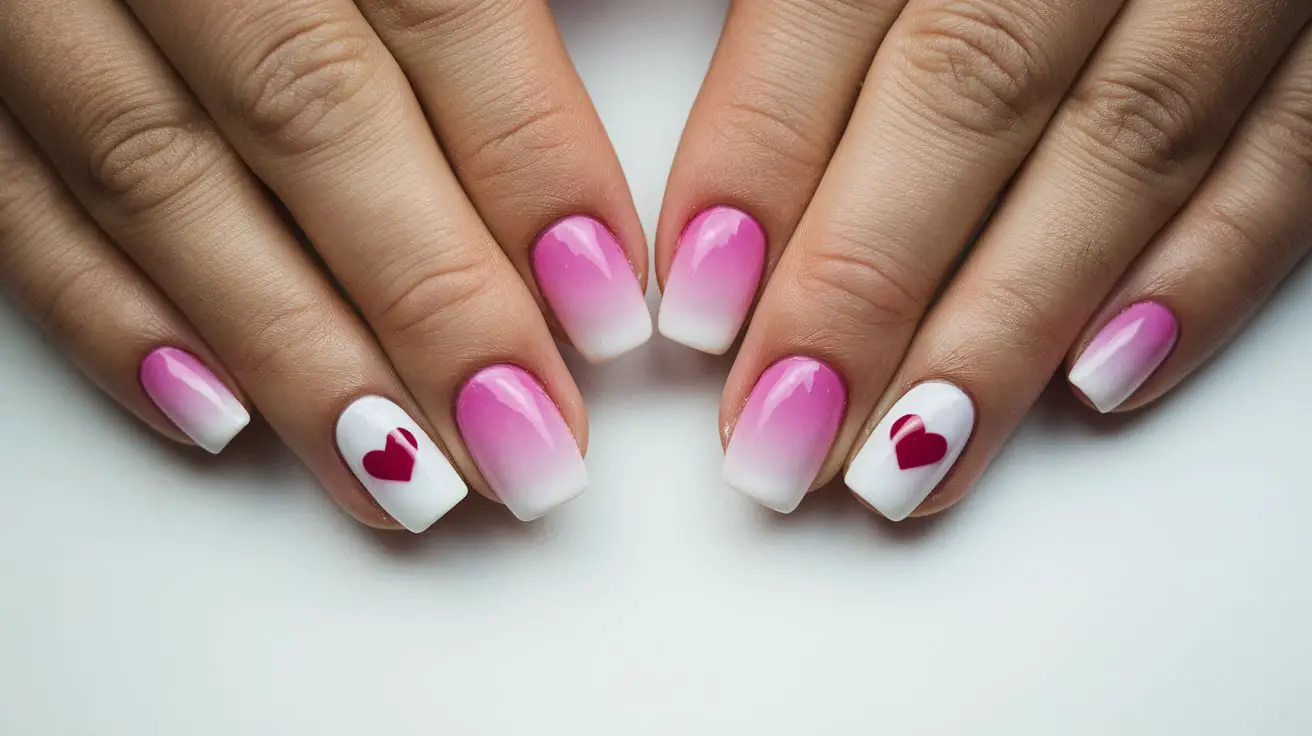
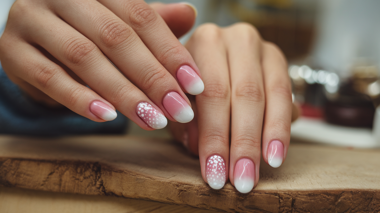
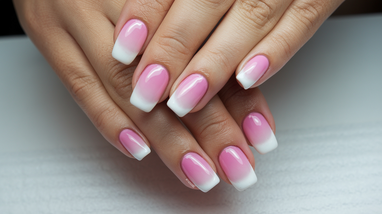
The most expensive-looking gradients often feature barely-there color shifts within the nude spectrum. A transition from sheer pink to milky white, or from beige to soft brown, creates understated elegance. These combinations work particularly well in professional settings where bold nails might seem inappropriate.
Selecting nudes that complement your skin tone prevents that corpse-finger effect that wrong nudes create. Cooler skin tones benefit from pink-based nudes transitioning to mauve or gray-beige. Warmer complexions shine with peachy nudes moving toward caramel or golden beige. The right nude gradient enhances your hands rather than washing them out.
Building depth within neutral palettes requires attention to undertones. A successful gradient might move from warm ivory through cool greige to taupe with purple undertones. These subtle shifts create complexity that catches light differently at various angles, mimicking the dimensional quality of expensive gel manicures.
Gray-based neutrals offer modern sophistication that feels fresh yet timeless. Gradients moving from palest dove gray through medium slate to deep charcoal provide drama without color. These combinations photograph beautifully and complement both casual and formal attire equally well.
When to use metallics
Metallic elements can elevate a gradient to luxury status when applied with restraint. Rather than creating entire gradients with metallic polish, consider using metallic shades as accent points. A nude gradient with the faintest hint of rose gold at the tips suggests expensive subtlety rather than obvious glitter.
The quality of metallic polish matters enormously. Cheap metallics often appear chunky or separate on the nail, creating texture that looks unrefined. Investment-worthy metallic polishes contain finely milled particles that create smooth, mirror-like finishes. These formulas blend seamlessly into gradients without creating obvious texture changes.
Mixing metallics with cremes requires careful consideration. The different finishes can clash if not properly balanced. Generally, metallics work best as the lighter shade in a gradient, allowing their reflective properties to catch light at the tips or base rather than dominating the entire nail.
Copper and bronze tones offer sophisticated alternatives to typical gold and silver. These warmer metallics complement a wider range of skin tones and feel less expected. A gradient from nude pink to soft copper, or from taupe to antique bronze, suggests understated wealth rather than obvious flash.
The placement of metallic elements within your gradient affects the overall impression. Concentrated metallic at the tips creates a modern French manicure effect, while metallic at the base adds unexpected interest when hands move. Consider where you want to draw the eye and place your metallic accordingly.
Remember that sophisticated color choices often involve what you leave out rather than what you include. Restraint in color selection, focusing on harmonious transitions rather than dramatic contrasts, consistently produces that expensive aesthetic. Your gradient should enhance your overall appearance rather than compete for attention.
Master the Art of Nail Shape and Length
The shape and length of your nails fundamentally determine how expensive your gradient manicure appears. Even perfect color application can’t overcome poorly shaped or inappropriately long nails. Understanding which shapes complement gradient designs and maintaining ideal proportions transforms amateur attempts into professional-looking results.
Which shapes look most expensive
Almond and oval shapes consistently read as elegant and expensive, particularly for gradient designs. These softly rounded shapes elongate fingers while providing ample canvas for color transitions. The gentle curves mirror the flowing nature of gradient effects, creating visual harmony that square or coffin shapes sometimes lack. Their classic appeal never goes out of style, making them safe choices for those seeking timeless sophistication.
The soft square shape offers a modern compromise between edgy and elegant. With straight sides and gently rounded corners, this shape provides structure without harshness. Gradients appear particularly striking on soft square nails because the shape offers maximum surface area while maintaining refinement. This shape works especially well for women who use their hands frequently but still want polished-looking nails.
Short, round nails might seem limiting, but they can look incredibly expensive with the right gradient application. The key lies in proportion – keeping the gradient subtle and well-balanced prevents overwhelming small nail beds. This shape suggests practicality and taste, particularly appealing for professional women who need functional yet beautiful nails.
The ideal length for gradient designs
Medium length nails showcase gradients optimally without appearing excessive. Specifically, nails extending 3-5 millimeters past fingertips provide sufficient space for color transitions while maintaining elegance. This length allows for clear color demarcation without requiring extreme precision that longer nails demand.
Shorter nails can absolutely rock gradient designs, but the approach differs slightly. Rather than attempting complex multi-color transitions, shorter nails benefit from two-tone gradients with gentle shifts. The compressed canvas means each color needs more impact, so choose shades with sufficient contrast to read clearly even on minimal space.
Extremely long nails rarely appear expensive, regardless of gradient quality. Beyond practical concerns, very long nails often look costume-like rather than classy. If you prefer longer lengths, aim for nails that extend no more than one-third the length of your nail bed. This proportion maintains balance while providing plenty of gradient real estate.
The relationship between nail width and length affects perceived expense. Narrow nail beds look best with proportionally shorter lengths, while wider nails can support slightly more length without appearing unbalanced. Pay attention to your natural nail shape when determining optimal length for gradient designs.
How shape affects the gradient
Different nail shapes distribute color differently within gradient designs. Almond shapes naturally guide the eye upward, making vertical gradients particularly striking. The tapered tip creates an arrow effect that elongates fingers and makes hands appear more graceful. This shape works beautifully with gradients that darken toward the tip.
Square and squoval shapes provide uniform width that suits horizontal gradients exceptionally well. The consistent canvas allows for even color distribution without distortion. These shapes also handle diagonal gradients better than pointed shapes, offering more creative freedom in color placement.
The curve of your chosen shape influences how light reflects off the gradient. Rounded shapes create gentle light play that softens color transitions, while angular shapes produce more dramatic light and shadow effects. Consider your lifestyle and lighting conditions when selecting shapes – office fluorescents favor different shapes than natural sunlight.
Certain shapes require modified gradient techniques for best results. Stiletto and coffin shapes, with their dramatic angles, need careful color placement to avoid emphasizing length excessively. Keeping darker colors at the base and lighter shades at tips prevents these shapes from appearing aggressive or claw-like.
Filing techniques for professional results
Professional-looking shapes start with proper filing technique, not expensive tools. Always file in one direction rather than sawing back and forth, which creates micro-tears that lead to peeling and breaking. This single change dramatically improves nail health and appearance, allowing gradients to last longer without chipping.
The angle at which you hold your file determines the final shape. For oval nails, hold the file at a 45-degree angle and work from the sides toward the center. Square shapes require perpendicular filing across the tip, followed by gentle corner rounding. Understanding these angles prevents accidental reshaping that ruins gradient proportions.
Glass or crystal files produce the smoothest edges that don’t snag or catch. While the initial investment exceeds disposable emery boards, these files last years and create professionally smooth edges. Smooth edges prevent polish from chipping at tips, maintaining that expensive look longer.
Your filing rhythm matters more than speed. Consistent, measured strokes create even shapes across all ten nails. Count your strokes per section to maintain symmetry – if the left side takes six strokes, match that on the right. This attention to detail separates salon-quality shaping from obvious home manicures.
Creating identical shapes across all nails requires constant comparison. After shaping each nail, hold your hands together at eye level to spot discrepancies. Small variations become glaringly obvious once polish applies, so invest time in achieving uniformity before beginning your gradient.
Buffer use after filing smooths any remaining roughness that might cause polish irregularities. A four-way buffer, progressing from coarse to ultra-fine, creates the glass-like smoothness that expensive manicures display. This final step ensures your gradient applies evenly without catching on nail texture.
Shape and length choices profoundly impact gradient success. The most expensive-looking combinations balance proportion, practicality, and personal style while providing optimal canvas for color transitions.
Add Strategic Finishing Touches
The difference between amateur and expensive-looking gradient nails often lies in the final details. These finishing touches require minimal extra time but dramatically elevate the overall appearance. Professional nail artists know these small steps separate mediocre manicures from those that command attention and compliments.
Top coat selection matters
Not all top coats deliver equal results, particularly over gradient designs. The formulation you choose can enhance or diminish hours of careful work.
Quick-dry top coats might seem convenient, but they often shrink polish and cause edge pulling that ruins clean lines. For gradient manicures, a self-leveling top coat works magic by smoothing any texture from sponging or color buildup. These formulas flow into tiny imperfections, creating that glass-like finish associated with expensive manicures.
High-shine top coats specifically designed for nail art maintain clarity without dulling colors beneath. Some standard top coats yellow over time or cloud certain pigments, particularly purples and blues. Investing in a quality top coat protects your color investment and maintains vibrancy for the full wear time.
The application technique for top coat over gradients differs from standard manicures. Rather than multiple thin coats, one slightly thicker coat prevents dragging that can disturb carefully blended colors. Float the brush over the nail surface rather than pressing down, allowing the formula to self-level without disrupting underlying polish.
Reapplication timing affects longevity significantly. Adding a fresh top coat layer every three days maintains shine and prevents chipping that cheapens appearance. This simple maintenance step extends your gradient’s life by a full week, maximizing your time investment.
Subtle accent details
Strategic embellishments can elevate gradients when applied with restraint. A single rhinestone at the base of an accent nail, or the tiniest line of gold leaf at the cuticle line, adds luxury without overwhelming. The key word remains subtle – these details should be discovered, not announced.
Negative space incorporated into gradient designs creates modern sophistication. Leaving a thin strip of bare nail at the cuticle or creating geometric cutouts within the gradient adds architectural interest. This technique requires precision but delivers high-impact results that photograph beautifully.
Matte sections contrasting with glossy areas offer textural interest without adding bulk. Consider matting just the darker portion of your gradient while keeping lighter sections glossy, or vice versa. This interplay of finishes suggests thoughtful design rather than basic application.
Cuticle care impact
Nothing ruins an expensive-looking gradient faster than ragged cuticles or dry skin surrounding nails. The contrast between beautiful polish and neglected skin immediately signals amateur status.
Professional cuticle appearance starts days before polish application. Daily cuticle oil application maintains suppleness that prevents hangnails and peeling. Jojoba oil closely mimics natural nail oils, penetrating deeply rather than sitting on surface skin. This preparation creates the perfect frame for gradient designs.
Pushing back cuticles correctly creates the illusion of longer nail beds, providing more gradient canvas. Never cut living tissue – only remove dead skin that lifts away easily. Aggressive cuticle removal leads to hardening and thickening that permanently cheapens nail appearance.
The polish-free gap at the cuticle requires precision. Professional manicures maintain a hair-thin space between polish and skin, preventing lifting and extending wear. This gap should be consistent across all nails – varying distances immediately flag home application. Practice with a thin brush dipped in acetone to perfect cleanup techniques.
Regular hand cream application throughout wear maintains that expensive aesthetic. Dry, cracked hands make even perfect gradients look cheap. Keep travel-sized hand cream everywhere – car, desk, purse – for frequent moisturizing that maintains overall presentation.
Minimalist embellishments
When adding decorative elements to gradients, less always looks more expensive. Single elements strategically placed outclass multiple decorations scattered across nails. Think one perfect pearl rather than ten rhinestones.
Ultra-thin metallic striping tape creates clean lines that suggest architectural inspiration:
Placement Options: Single vertical line off-center, horizontal line at the gradient midpoint, or diagonal accent
Color Coordination: Match tape finish to jewelry you wear regularly for cohesive accessorizing
Application Timing: Add tape before final top coat to ensure adhesion and smooth finish
Removal Planning: Lift tape edges slightly before top coat application for easy future removal
Minimal nail art stamps in coordinating colors add interest without chaos. A single delicate design on each ring finger, or tiny symbols at the base of thumbs only, suggests intentional restraint. Choose designs that complement rather than compete with your gradient.
Chrome powder applied selectively creates expensive-looking dimension. Dust the finest amount over just the tips or just the base, rather than the entire nail. This technique adds depth without the obvious glitter that often cheapens manicures.
The absence of embellishment can be the ultimate luxury statement. A perfectly executed gradient with flawless finish often looks more expensive than decorated versions. Before adding any extras, step back and honestly evaluate whether additions improve or detract from your design.
These finishing touches transform competent gradients into conversation pieces. Master these details, and your nails will consistently appear professionally done, regardless of where you actually create them.
Invest in Professional-Grade Products
The products you choose fundamentally determine whether your gradient nails look expensive or cheap. While technique matters enormously, even perfect application can’t overcome inferior formulas. Understanding which products deserve investment and where you can economize helps achieve professional results without breaking your budget.
Products worth the splurge
Base coat quality directly impacts everything that follows. Professional-grade base coats create optimal adhesion while protecting natural nails from staining. They also provide the perfect slightly tacky surface for gradient application. Cheap bases often cause premature peeling or allow pigments to seep through, yellowing nail beds over time. A superior base coat extends your manicure life by days, making the higher price worthwhile.
Polish formula makes or breaks gradient success. Professional brands formulate their polishes with ideal consistency for blending – not too thick, not too runny. These polishes maintain wet edges longer, allowing working time for seamless gradients. The pigment quality in expensive polishes also means better coverage with fewer coats, actually saving product over time.
Investing in proper gradient tools elevates results dramatically. Professional makeup sponges designed specifically for nail art compress evenly and transfer color smoothly. Kitchen sponges or cheap alternatives create texture and waste polish. Similarly, quality detail brushes for cleanup last years versus weeks for disposable versions.
Budget alternatives that deliver
Not every product requires premium investment. Acetone for cleanup works identically whether you buy salon brands or drugstore versions. The key lies in pure acetone versus nail polish remover – spring for 100% acetone regardless of brand for professional results.
Some affordable polish brands rival expensive alternatives for gradient work. Look for brands that specifically mention “self-leveling” or “high pigment” formulas. These often perform beautifully at fraction of prestige prices. Test consistency by brushing polish onto paper – quality formulas spread evenly without streaking or separating.
DIY tools can match professional versions with creativity. Makeup wedges from beauty supply stores cost pennies compared to “nail art sponges” yet deliver identical results. Small flat eyeshadow brushes work perfectly for cleanup when dedicated nail brushes seem overpriced. Even old gift cards cut into triangles create sharp lines for geometric gradient designs.
Practice polishes don’t need to be expensive. While your final gradient deserves quality products, learning techniques works fine with clearance polishes. Build your skills with cheap formulas, then execute with professional products once you’ve mastered the motions. This approach prevents wasting expensive polish during the learning curve.
Base coat importance
The right base coat does more than prevent staining – it creates the foundation for long-lasting, expensive-looking gradients. Ridge-filling bases smooth nail texture that would otherwise telegraph through gradients, creating bumpy, unprofessional appearances. These specialized formulas contain tiny particles that settle into imperfections, creating silk-smooth surfaces.
Rubberized base coats revolutionize gradient longevity. These flexible formulas bend with natural nails, preventing the cracking and peeling that plague standard manicures. For gradient designs that require multiple polish layers, this flexibility prevents stress fractures that develop from polish thickness.
Some base coats serve double duty by promoting nail health. Formulas containing proteins, vitamins, or strengthening agents improve nail condition over time. Healthier nails provide better gradient canvases and hold polish longer. Consider these treatment bases as investments in future manicures, not just current ones.
Long-lasting formulas
Gel-hybrid polishes offer exceptional gradient longevity without UV lamps. These formulas cure in natural light, creating durable finishes that last two weeks. While more expensive initially, the extended wear time means fewer manicures monthly, actually saving money and time long-term.
Look for polish lines specifically marketed as “long-wear” or “extended-wear” systems. These usually include coordinated base coat, color, and top coat engineered to work together. Using products from the same system ensures chemical compatibility that maximizes adhesion and wear time.
The age of your products affects their performance significantly. Old, thickened polishes never create smooth gradients, regardless of original quality. Professional nail artists replace products showing any separation, thickening, or consistency changes. Fresh products blend better and last longer on nails.
Storage conditions preserve product quality. Keeping polishes in cool, dark places prevents premature thickening and separation. Never store nail products in bathrooms where temperature fluctuations accelerate deterioration. A dedicated drawer or cabinet away from heat and light maintains formula integrity for maximum product life.
Color selection within professional lines offers advantages beyond individual polish quality. Professional brands maintain consistency across their color ranges, ensuring different shades blend predictably for gradients. Mixing brands often results in incompatible formulas that won’t merge smoothly despite similar colors.
Quality products form the backbone of expensive-looking results. While skilled technique can partially compensate for inferior products, combining excellent technique with professional-grade materials guarantees that luxurious finish. Consider product investment as purchasing multiple beautiful manicures rather than single-use items.
Final Thoughts for Flawless Gradient Nails
Creating gradient nails that genuinely look expensive comes down to mastering these five essential elements. Your blending technique, color selection, nail shape, finishing touches, and product quality all work together to achieve that coveted high-end appearance. Each component builds upon the others – exceptional products won’t save poor technique, just as perfect application can’t overcome badly shaped nails or cheap formulas.
The investment you make in learning these techniques and selecting the right products pays dividends beyond just beautiful nails. When your manicure looks professionally done, it elevates your entire appearance and boosts confidence in any setting. Take time to practice each element separately before combining them, and remember that achieving that expensive look requires patience and attention to detail rather than rushing through the process.
Frequently Asked Questions
Q: How long should I wait between gradient layers to avoid smudging?
A: Wait until each layer feels tacky but not wet to touch – typically 3-5 minutes depending on formula thickness and room temperature. The surface should feel slightly sticky but not transfer polish when lightly tapped.
Q: Can I create expensive-looking gradients with regular nail polish or do I need gel?
A: Regular polish absolutely works for luxurious gradients when you choose quality formulas and use proper techniques. Gel offers longer wear but isn’t necessary for achieving that expensive appearance.
Q: What’s the biggest mistake that makes gradient nails look cheap?
A: Harsh, visible lines between colors instantly cheapen the look. This usually results from rushing the blending process or working with polish that’s already too dry to merge properly.
Q: How many colors should I use for the most expensive-looking gradient?
A: Two to three colors maximum within the same color family create the most sophisticated results. More colors often look juvenile or chaotic rather than elegant.
Q: Which nail shape makes gradients look most expensive on short nails?
A: Soft square or round shapes work best on shorter nails, providing maximum gradient space while maintaining elegance and proportion.
Q: Should gradient nails always go from light to dark?
A: Not necessarily. Light-to-dark creates classic elegance, but dark-to-light can look equally sophisticated. The key lies in smooth transitions regardless of direction.
Q: How often should I reapply top coat to maintain that expensive shine?
A: Every 2-3 days prevents dulling and extends your manicure’s life. This simple maintenance keeps gradients looking freshly done for up to two weeks.
Q: Can I fix a gradient that didn’t blend well without starting over?
A: Yes, apply a sheer coat of the mid-tone color over the entire nail, then immediately re-sponge the gradient while this layer remains wet. This technique softens harsh lines and improves blending.